
Duration
May 2021 - Present
Work Type
Contract (ongoing)
Tools
Miro, Xd, Ps, Figma, Zeplin
Role
Interaction + Growth Design

Street FC's beta connects 5,000 active players via their platform to local fields in NYC and Austin. This is the story of designing V2 + V2.5.
The Problem
Churn was low, monthly active users were high, but new registered users were plateauing and Philadelphia goes live in 8 weeks.
My Role
I was responsible for all UI and UX design working closely with the Project Manager, Creative Director, COO, and Developer.
Process
Stakeholder kickoff meeting, PMF, comp analysis, JTBD, ideation, ethnographic research, design validation, synthesis.
Constraints
Any valid but non-actionable insights would be placed in a v3 bucket. Solutions had to be actionable within 2, 6 week sprint windows.
Looking at the data, getting a user to their second game saw a retention rate of 94%.
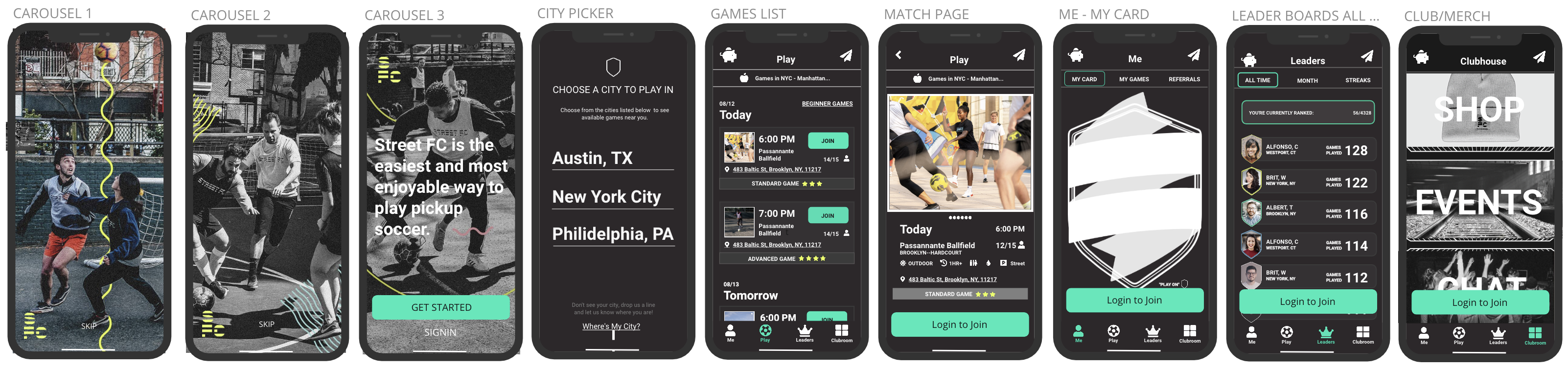
The user flow below is what you would expect to see in a 'logged-out' state, allowing users to see beyond 'the velvet rope' and experience Street FC's CVP, quick TTV, low friction.

After speaking with the stakeholders, reviewing user data, user interviews and feedback our immediate objectives were to (1) reduce friction in onboarding, (2) make the product more discoverable--this was especially important as they were launching in Philadelphia in 8 weeks, (3) reduce friction between games while increasing engagement.
Everything exists in this space to satisfy PMF’s litmus: many potential customers, significant customer growth potential and clear paths to customer acquisition. Growth is supply limited so partnering with field owners (either private or public) in every major city we enter would keep unit economics low and inventory high. Insights are presented below validating Street FC's decision to be a hardcourt (asphalt) focused soccer platform:
Basketball courts have the greatest and most equitable distribution in NYC generally but sit unpermitted 92% of the time meaning there's a significant opportunity for composite demand on NYC's 1,800 courts.

The PMF process yielded two possible significant white spaces: the first validated Street FC's approach (see above) while the second focused in on underserved communities, surfacing desirability and redistributing peak demand through composite court use. I had the privilege of presenting my findings to the COO which have since been incorporated into their medium and long term growth strategy. Out of respect for the NDA the specific solution has been omitted.
The market space has two direct competitors: Justplay and Opensports. Both Open Sports and Justplay’s time to value (TTV) is significantly shorter. Both competitors also provide a near immediate preview of the users expected outcome (JTBD)--pain it mitigated by surfacing available games nearby. Primary + Secondary CTA are also more clear reducing cognitive load, time on task and increasing momentum.

HMW help new users (NUX) discover games (value) quickly and efficiently.
HMW help users complete ratings with minimal cognitive/interaction cost?
Based on my onboarding/matchmaking hypotheses I sketched out the initial user flow (first flow) and two iterations that could scale with growth. The first of those (second flow) the user manually selects their city. The second version (third flow) places games in context a la AIrbnb's NUX (good value proposition for permission request).

The following solutions (V2) were created after 6 rounds of Stakeholder reviews. I've chosen to combine and consolidate feedback and share the iterative solutions to each opportunity sequentially instead of chronologically to make the discovery process more cohesive.
Initially the TTV took 12-14 screens. Here it's been lowered to 4 by allowing the value proposition to happen without having to first log in.
Capturing people’s faces for profile pictures--initially a part of the onboarding and preference capture were removed because the friction/interaction costs were too high. Additionally, there’s compelling evidence linking TTV and user retention and I wanted save the permission ask for something mutually beneficial (see below).

In the onboarding new user experience flow (NUX) I proposed that a notification permission was of more value to both the user (reducing the pain of missing a game or unexpected changes to the game) and Street FC--as the ‘external trigger’ in the first step of a hook-model cycle.
I used soft-ask permissions and flexibility and efficiency of use to keep friction low for power users and momentum high for all user types.

In the 'Games Page Beta' there were several opportunities to help users with the twin challenges of evaluation and execution. They were: displaying a written address, spots available, players currently registered (avatar circles), clear CTA.
In V2 player avatars (1) were ditched for pictures of the court (2) because users are more likely to recognize a court rather than recall its address. Address is now a hyperlink (3) to a map providing location in context and proximity to the user ("is this close or far away?"). Counting down to 0/15 for spots available (4) doesn't meet user expectations (mental models) so we now count up to 15/15 (5). Clearer CTA (6). Iconography (7) allows users to predict what the outcome (JTBD) looks like in more detail assuaging fears like: "is there water there?, are there bathrooms?, where can I park? etc".

Stakeholders wanted to create a "review wall" whereby players couldn't play their next game until they'd reviewed all players from the previous game. In their minds this was an opportunity to showcase player cards.
My design purposefully diminished this step allowing users to skip the rating process almost entirely (1). I got a lot of pushback even after citing our "optimal solution"--getting users to their second game. I needed more stakeholder buy-in so I conducted a series of ethnographic studies by playing in 2 games the following week.

I attended two games and interviewed 8 players asking each a series of questions about their experiences with the app, matches and players. Here are my discoveries:
Framing the game/rating experience with Daniel Khaneman's 'memories and the peak-end rule' made the argument for diminishing the ratings flow that much more compelling. Able to now substantiate my claims about the ratings process I revisited the designs in V2.5.

Based on my research I listed out the following insights as assumptions I could make about how to procede with the design.
I listened to the stakeholders concern about diminishing the value of the card while preserving low interaction costs. The solution was a unique shield (1) for each rating event. Swiping is a familiar interaction pattern (2), clear CTA (3) with larger simpler targets (Fitt's law) and Floating Action Buttons (4) and the ability to exit the flow at any point (5).

After seeing how excited players got when they recognized a person they'd played with before I thought about opportunities to surface community during the apps first screens: the 'loading sequence' (1) seemed like a great opportunity to engage. By giving the user a visual ‘outcome’ (JTBD: situation, motivation, outcome) at the beginning of the user flow via a carousel we could augment their motivation vis a vis strong branding while planting seeds for an internal trigger ("I wonder if I made the carousel today!?).
New brand colors were important for reducing eye fatigue while increasing accessibility (2). Game rating (3) trumped iconography on the games screen but remains for game cards (4). Reusability + components were hugely important for the Dev team (5).

The soft ask is especially important here in light of recent changes to system level permissions (1). At a time when most users would expect to hit a pay wall we offer reciprocity in the form of a free game (2). The hope is that this gift offsets the costs associated with the preceding survey (3) and that they buy into its value proposition (ie. making matches more accurate and games more enjoyable).
The monochromatic onboarding process, large CTA, work to keep users cognitive load low, visibility of system status high, and users out of the weeds (gulf of evaluation and execution).

After diminishing the ratings process a leaderboard seemed like the perfect way to showcase card variability and establish value and desirability.
First two screens are the final iterations of the leader board--for the sake of dev resources we went with the first. A new color palette was selected with primary and secondary colors. Lastly, the 10 stages of turquoise where color represents total number of games played (lifetime) and the sparkle indicates length of your streak (10 days).

Discoverability was hugely important within the scope of our growth strategy and the ability to get a feel for the product before committing, a continuation of Street FC's brand values: transparency and utility.
The red route represents an opportunity for Street FC to measure desirability in cities they aren't in yet. The green route represents a user scrolling to the end of that weeks 'games page' under "Play" where a countdown timer lets them know when next weeks games drop. A user is also able to look at primary screens under "Me" (the gift wrapped shield), "Leaders" (leaderboard), and "Clubroom" (shop, events, chat).

